OVERVIEW
OBJECTIVE
To provide beautifully displayed and easy to understand wind, wave and weather reports, forecasts and statistics for sailors, surfers, divers and any other water sport aficionado.
CONTEXT
For this project, I explored ways to take a weather report app to the next level through research, analysis, and best practices in UX design. Some of the factors that this project set out to solve included designing easy-to-comprehend data displays, figuring out ways to encourage users to get in the habit of checking the app before heading out to the water, and making the UI both functional and appealing.
Click here to see the final mobile prototype
PROCESS

COMPETITIVE ANALYSIS
GOAL
Learn about the current market of surfing weather apps, and to identify the issues and opportunities that exist in this space.

COMPETITOR PROFILES
I spent time researching multiple competitors that were on par with the app I was looking to design. This helped me to isolate what current issues and potential solutions exist in the surf and weather app space.

MARKETING PROFILE
In order to learn more about the type of users current surf weather apps are aiming to appeal to, I looked at the current marketing strategies that my competitors were using, and where they were situated in this space. I looked at their websites, social media presence, and whether or not they were referenced by other surf entities (websites, blogs, etc.)

SWOT PROFILE
I built a SWOT profile for the competitors in order to outline the foremost strengths, weaknesses, opportunities, and threats of each competitor. By evaluating these elements I was able to determine what was working, what could be improved, and where there was room for a fresh perspective or innovation to how things are currently being done.
Click here to see a detailed SWOT profile

UX ANALYSIS & HEURISTIC EVALUATION
I downloaded each of the competitor apps and made notes on the usability, layout, navigation structure, compatibility, and calls to action. After collecting this information I was then able to put together action items and insights as to how to position my app in the marketplace and be a competitive option to what currently exists.
USER RESEARCH
GOAL
Identify the needs and demographics of potential users.
USER GOALS
Prior to conducting user interviews I took some time to determine what insights would be valuable to collect from potential users. I put together a problem statement and research goals in order to clarify my process. I identified my research goals as the following:
- Understand what information surfers and other water sport enthusiasts use to make decisions regarding going out on the water
- Understand what safety concerns may come up
- Learn about what features and reports Vela should provide in order to be useful to the user group
- Learn about what apps / websites the users currently use to make decisions, and the pain points and points
of friction they experience
USER INTERVIEWS
I created a script and thirteen questions with the focus on discovering a user's motivation and behavior when using surf weather apps. I interviewed people within the following demographic in order to better understand the needs and behaviors of surfers:
- 3 surfers of different levels of proficiency
- Live in or travel to areas where they spend time on the water weekly, monthly and yearly
Aged 27, 30 and 41 years old
SOME KEY TAKEAWAYS
- People that live near water usually aim to go out 1-2x per week
- People that live a moderate distance from the water (1.5 hours+) aim to go out twice a month
- Some like to make one vacation / surf trip per year that involves flying somewhere or a longer road trip
- The majority use phone over computer
- People use a mix of the weather channel (or Weather Underground) for general and large scale weather reports (storms, temp), as well as an app for specific water conditions
- Some frustrations related to not knowing how to interpret the data for a given spot. Users lean toward apps that basically say if each statistic means favorable or unfavorable conditions


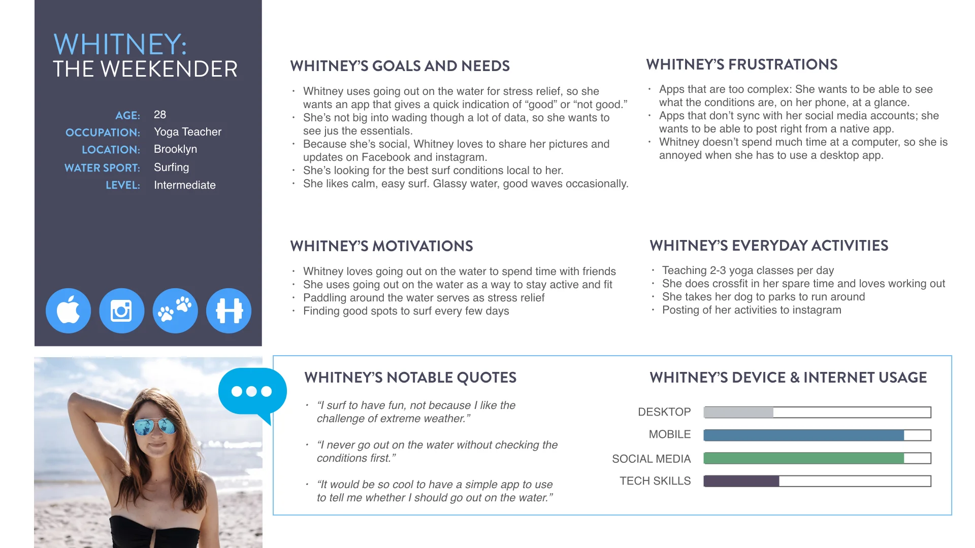
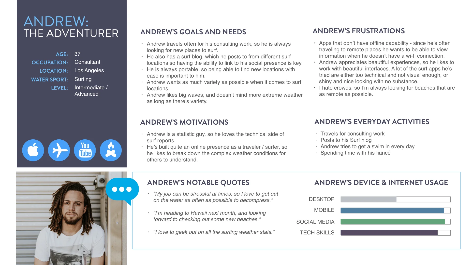
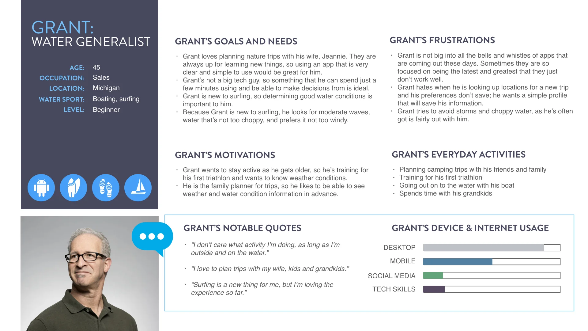
USER PERSONAS
From analyzing data from interviews and surveys,
I created personas to represent Vela's target audience
to further clarify the type of person that would likely use the app.
USER JOURNEYS & FLOWS
GOAL
Illustrate and empathize with what users are trying to accomplish, as well as better understand the motivations, limitations and potential frustrations.
USER JOURNEY MAPS
With the journey maps I outlined the path a persona would take to accomplish a task in a real-world scenario. Each journey was separated into phases and the potential thoughts and emotions that a persona may experience were outlined.
USER FLOWS
Once I identified the tasks each persona may want to accomplish, I took note of what steps would need to be taken, and solved the problem of how to build a direct and simple way to complete the task. After I noted the steps of the task, I built user flows in order to clarify the path a user may take within the app to complete the task.
Click here to see detailed user journeys

WIREFRAMING & PROTOTYPING
GOAL
Effectively demonstrate Vela's functionality and analyze how users would navigate through the user flow.
For a more detailed view of the low and mid fidelity prototypes, click here

SKETCHES
In order to focus on high-level functionality I first developed paper wireframes. This was a quick and inexpensive way to focus on the key features and not get too distracted with design at the outset.

LOW/MID-FIDELITY PROTOTYPES
Once I determined the apps high-level functionality I moved to Balsamiq and Sketch to translate my designs from sketches into simple prototypes. These designs helped me to better illustrate UI elements, communicating form and function in addition to the high-level aspects of the user experience.

HIGH-FIDELITY PROTOTYPES
Once I finalized my design drafts I used Sketch to create high-fidelity prototypes. This demonstrated how the app would look and function. After building my app's interface I then built out the interactivity between the different screens.

INTERACTIVE PROTOTYPE
In order to demonstrate Vela's functionality I used InVision to make the prototype interactive. I synched my design from Sketch with InVision using the Craft plugin and then added clickable elements to each screen. Once completed, the core functions and specific interactions of the app within a browser and on a mobile phone were illustrated. From here I was able to get feedback on the usability of the app and its features.
USABILITY TESTING
GOAL
Evaluate user's ability to complete specific tasks while using the app.
Click here to view the detailed Usability Test Plan and Report

TEST PLAN & SCRIPTS
In order to evaluate the usability and utility of the Vela prototype, I outlined the goals, scope and logistics of the testing sessions, as well as writing a test script to ensure consistency. In the test script I outlined core features I was looking to test, and had scenarios and tasks to guide the tester to the items for which I looking for specific feedback.
METHODOLOGY
I decided to use both moderated in-person and moderate remote testing sessions based on the location and availability of my testers. In-person interviews allowed me to observe body language and dig deeper with follow up questions based on my observations. For the remote interviews, they were conducted over Skype with screen sharing.
SESSIONS
During the testing sessions, participants were asked to complete tasks while interacting with the prototype on their mobile phone or desktop. I observed, listened, and recorded the speed, efficiency and ease with which participants completed the tasks. I was able to isolate usability problems and get insight into the level of satisfaction users had with the prototype.
ANALYSIS & REPORTING
In order to get the most out of the user testing and interviews I sorted and interpreted the feedback. I created a digital affinity map based on feedback and then recorded and classified user errors based on Jakob Nielsen’s Five Components on Usability. I also used Tomer Sharon's "Rainbow Spreadsheet" (seen above) to rank the errors and present my results in an organized manner. With this information I then identified the top errors that I needed to fix in the next iteration of my prototype.
REFINING THE DESIGN

GOAL
Polish the design of the prototype so it can be released for further testing.
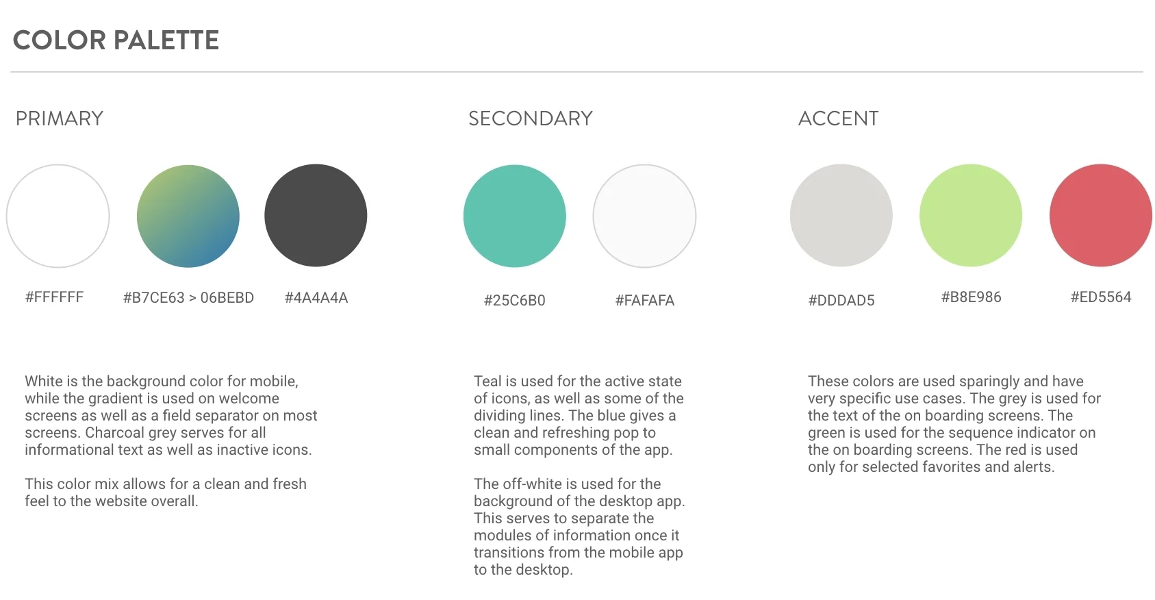
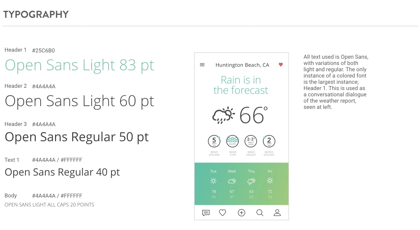
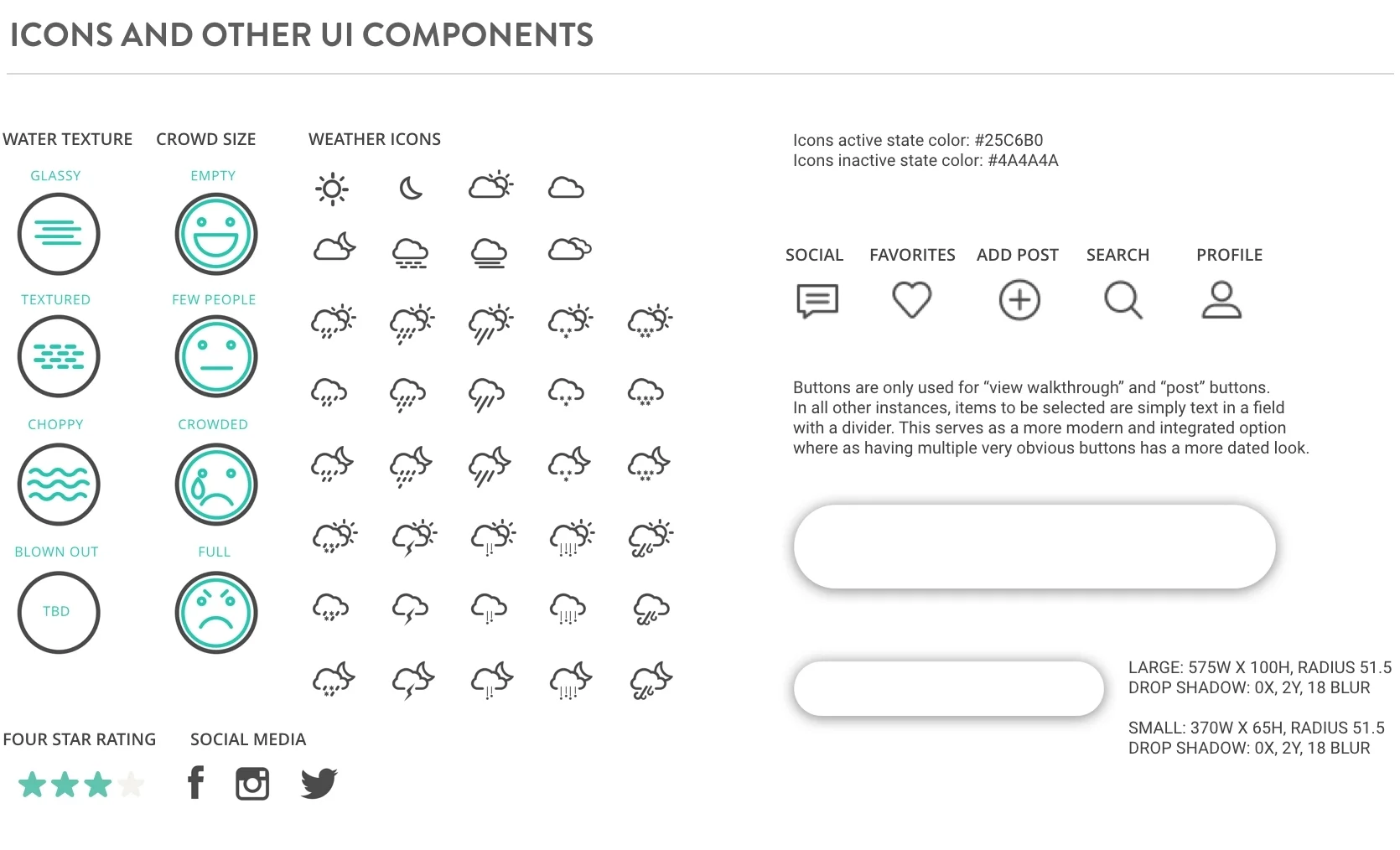
STYLE GUIDE
I created both a style guide and a design language system in order to ensure consistent use of all of the apps elements. These both helped in providing context and assuring that there is consistency across platforms and devices. I then referred to Google's Material Design System to make sure that my design and interactions adhered to these guidelines since I was developing a native app.
ACCESSIBILITY
To ensure my app would be useful to those with disabilities I reviewed accessibility guidelines and adjusted my design so that it would adhere to those guidelines. I increase my context of text colors and thickness and adjusted colors to ensure a 4:5:1 contrast ratio between graphics, text, and background colors. All buttons in the app had touchable targets of 48dp to ensure usability for people with impaired mobility.